Digital Account Opening
A fresh and modern platform for financial professionals
Kestra Financial is a financial services company which serves financial professionals in the broker dealer space in numerous ways. One of the primary offerings Kestra Financial provides for its customers is AdvisorComplete, its in-house digital platform for facilitating several of a financial professional’s daily tasks, including the data collection and processing of investment accounts.
In 2021, Kestra Financial decided to make a substantial investment in modernizing the account opening process on AdvisorComplete. The existing account opening experience was more than ten years old and in dire need of a modern refresh to both improve user experience and better collect necessary data.
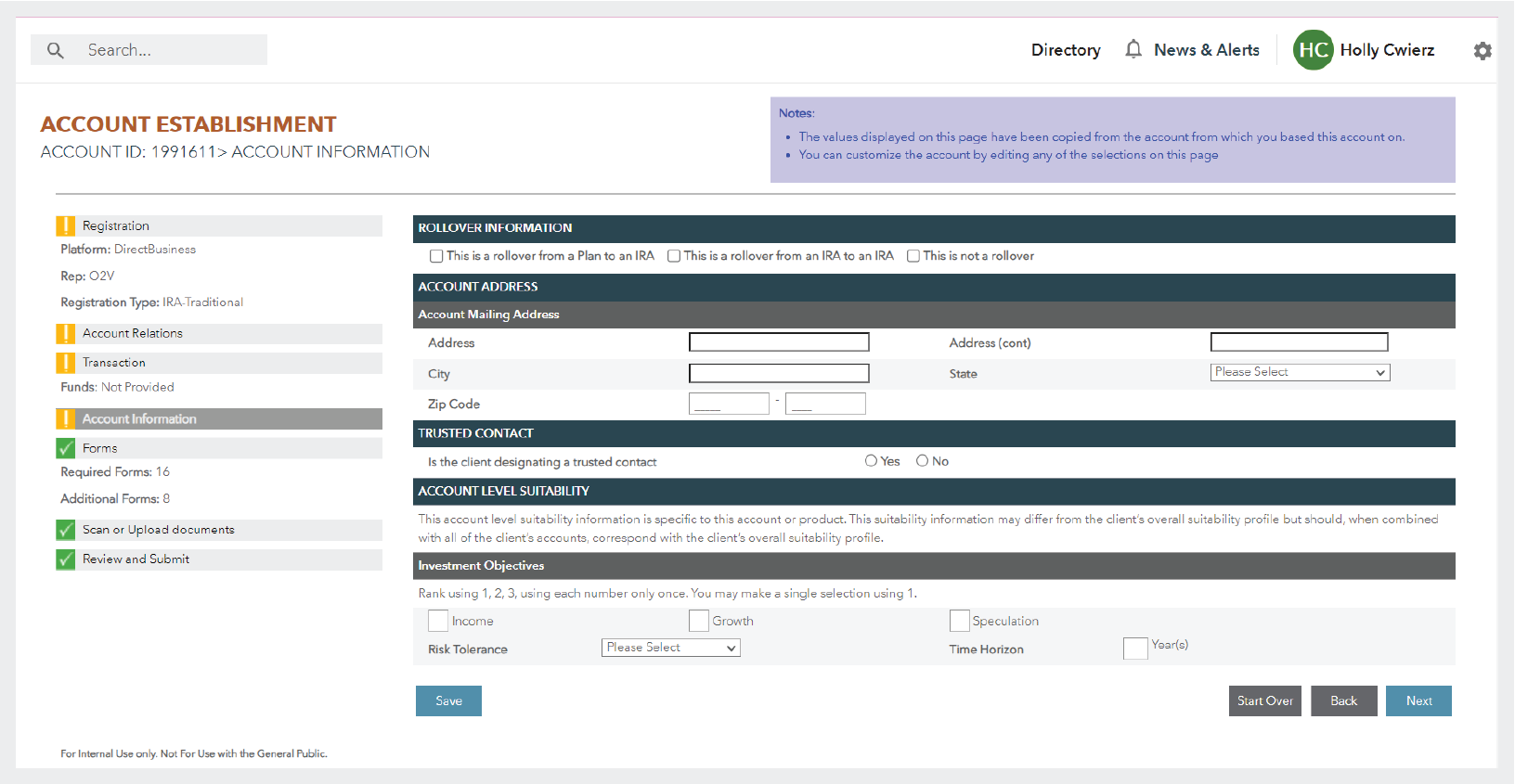
This is a screen from AdvisorComplete’s existing account establishment experience. This experience was more than ten years old and had not had substantial updates in that time.
This two year project would become the largest platform redesign in Kestra Financial’s history and would totally reshape and expand its existing design resources and process to be able to meet that substantial challenge.
A thoughtful design process from the ground up
To achieve this goal, Kestra Financial expanded its design team from 1 to 11 members, including product designers, graphic designers, illustrators, animators, and a design operations specialist.
The design team also put in place a new system for design operations to better manage the intense scale of design artifacts needed for this colossal project.
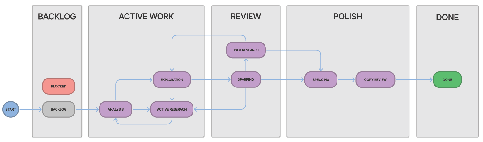
A diagram of the design process workflow which the design team implemented in Jira to be able to track design work. The flow is divided by the phases of their design process; these phases were represented in Jira as the columns of their kanban board. The various statuses would more specifically indicate the exact condition of the work within each phase.
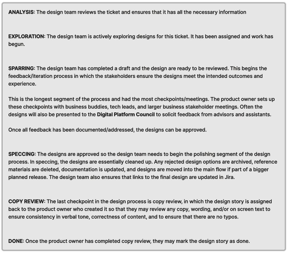
Definitions of the design statues the team adopted.
The design team worked with their project management team to set up a custom space in Jira for their team that would follow this design process and allow for their design stories to flow back and forth through their process as needed.
This was vitally important as the design process is typically non-linear and often needs to cycle back through when stress testing designs and sharing them with users and stakeholders.
This operational foundation would allow the design team to work quickly and efficiently through ideation and review without having anything fall through the cracks.
Who are their users?
To get started on understanding their problem, the designers first needed to get to know their users. The team defined personas for their typical user archetypes. This process was helpful not only for the new design team members to get to know their user base, but was also valuable to the seasoned team members to re-familiarize themselves with their core users.
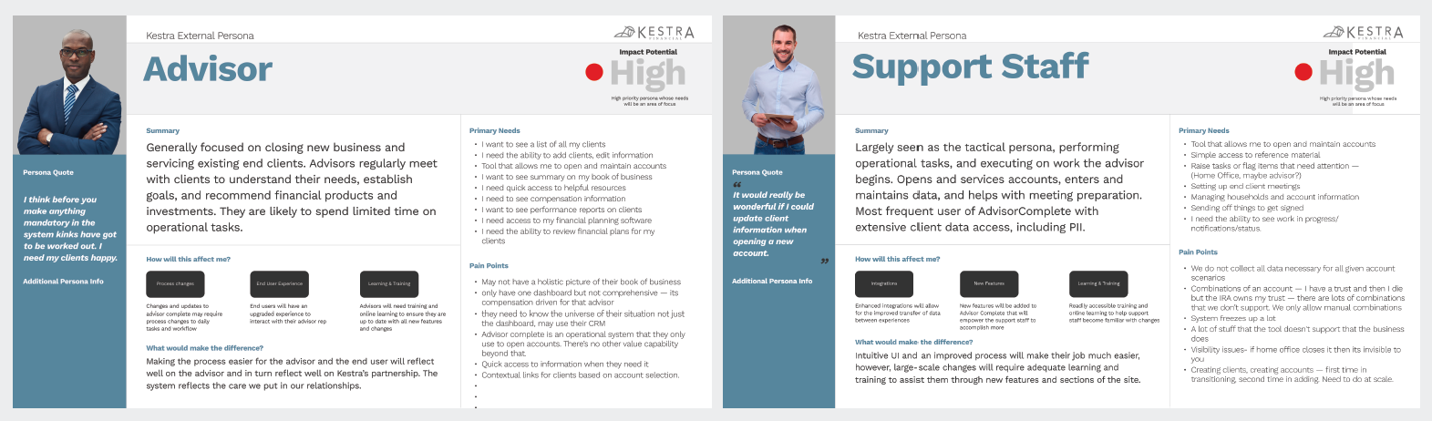
The team identified six personas who interact with AdvisorComplete to some extent.
Our two internal personas, Corporate and Home Office, represented Kestra Financial employees who utilize AdvisorComplete for some aspect of their jobs.
The spectrum of external personas included Principals (firm leads), Advisors, Support Staff, and End Clients/Investors. (End clients would only interact with the system through the signing and receiving of account documents.)
Across the six personas, the design team identified two primary user types which would be the most likely to interact with the application the team was building, Advisors and Support Staff.
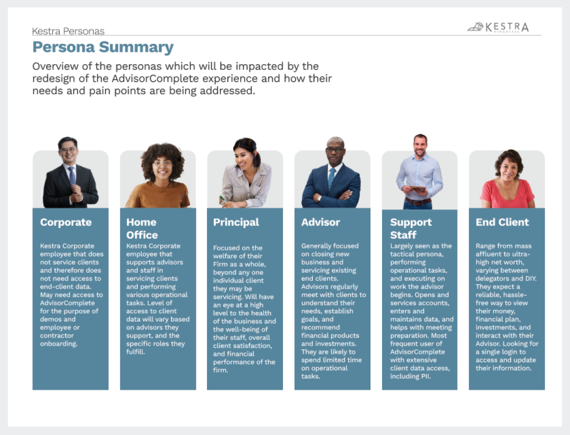
The six user personas that interact with AdvisorComplete in some shape or form.
Support Staff are typically responsible for most, if not all, data collection required for account opening, so they would be the power users. Advisors might only interact with the signing process of account opening, however they were also likely to be involved in the data collection process, especially if they came from smaller firms.
A more detailed view of the power users, the Advisor and the Support Staff.
People-focused design
By identifying their key user personas, the designers could begin to more specifically identify the problems the team needed to solve through design.
The primary focus for most Advisors is their relationships with their clients, and understanding their clients’ financial needs. This focus keeps them busy with in-person client meetings, meaning that they typically delegate most system tasks to Support Staff. The areas where they spend most of their time in AdvisorComplete include reviewing asset management data and paperwork signing activities. They are also more likely than other personas to access AdvisorComplete through a tablet or mobile device, as their relationship-focused day-to-day activities are more on-the-go than others.
Support Staff are the front line workers for data entry and account processing. They are responsible for making sure that all of the client’s personal information gets inputted into the system correctly while the Advisor is handling relationship management. Support Staff keep their offices running and often need to pause and pivot while in the midst of any task to take important phone calls or jump on any other urgent need. Therefore, Support Staff need to be able to easily find any work they previously started to pick it back up seamlessly. Data loss and having to redo or restart work are major concerns for Support Staff.
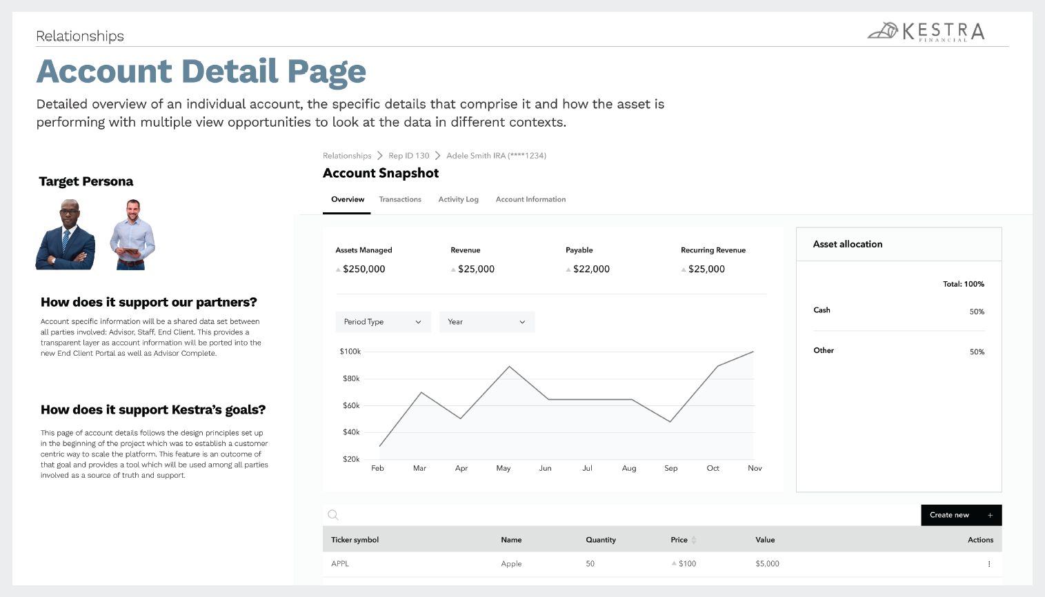
An exploration on the different perspectives each of their power user personas would bring to a system page like an account detail page. Keeping these diverse use cases in mind helped the design team create experiences that worked for each set of users.
Knowing the unique goals and challenges of their power users helped the design team create solutions that would improve their users’ daily lives.
Looking into the future
Before the team jumped directly into designing these new screens, the team took a step back and spent some time brainstorming how they wanted to clean up the organization of the current website.
They wanted to reorganize the sitemap on the application to give their users a more focused experience that would be easier to navigate.
This mindset of clean, task-focused organization would go on to heavily influence the designs of the digital account opening experience.
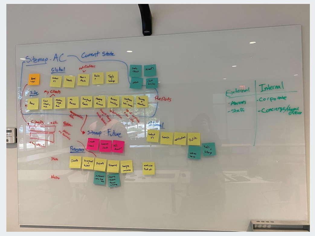
An early sitemap reorganization brainstorming session. The design team wanted to create a more focused site organization for their users.
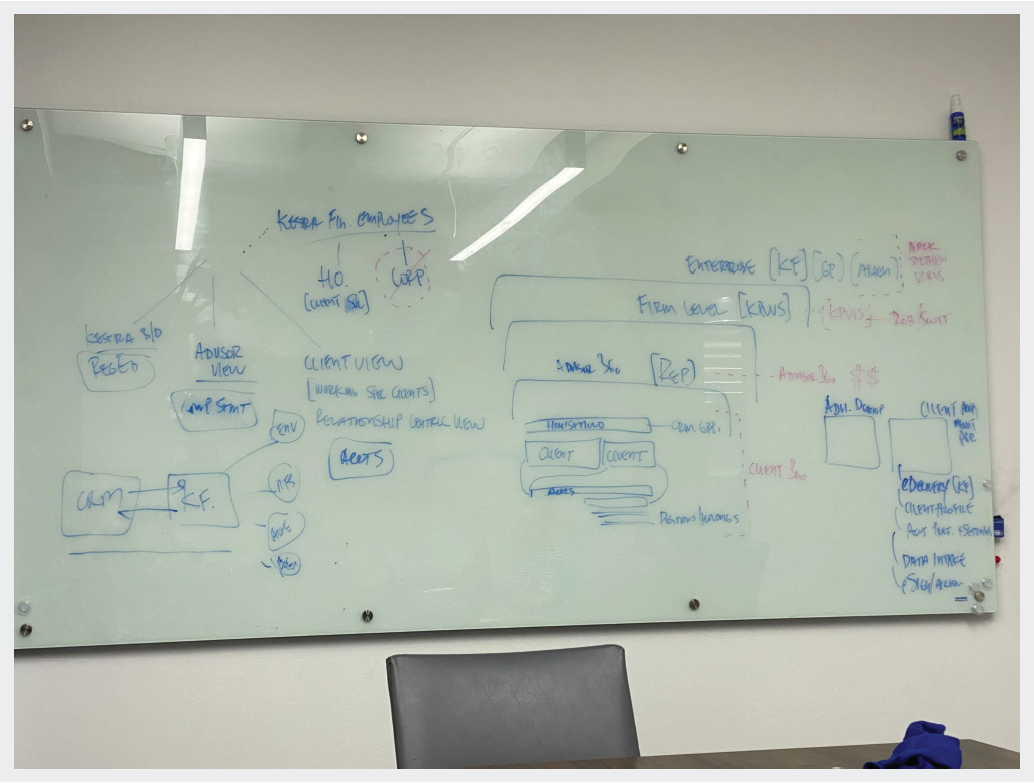
White boarding ideas for an update to the data hierarchy.
A foundation of collaboration
The design team made similar considerations in regards to data architecture, as this would allow them to mindfully organize the UI in ways that both made sense to their users, and was unhindered by database structure constraints.
Working with their engineering colleagues to think through this early foundation helped prevent interface limitations due to inflexible database design, and set a foundation of cross team collaboration with technical partners on this project.
Getting started
The designers hit the ground running with grayscale wireframes to solidify the slimmed-down and focused layout which the team believed would provide more efficiency for their users. This helped the design team set design direction with their business stakeholders and executive leaders and identify structural solutions to key problems the designers needed to address from the old system.
The designers’ primary objective was to redesign the account opening experience, and after their initial persona research the team identified that the primary user persona for this application would be the Support Staff. They are most often the users handling the majority of data entry for opening new financial accounts in AdvisorComplete, so the new experience needed to address their biggest concerns.
One of the biggest complaints for Support Staff who were familiar with the old system was the high potential for data loss due to a combination of content congested pages and a lack of background saving. This situation was also exacerbated by system time-outs and the general need Support Staff had to easily pivot back and forth between tasks as needed.
Concise organization
To address these pain points, the team knew they needed to reorganize the questions to be ordered in a more logical fashion while also limiting the amount of questions present on-screen at any given time. To solve this, the designers presented the information users needed to fill out in small digestible sections which helped prevent cognitive overload, and effectively gave users save points throughout every page of the wizard.
The designers began by first dividing the major sections of the account application into groups they called “Acts,” like in a play. These acts would be represented in horizontal navigation across the top of the page. The navigation bar would also behave as a progress tracker for the user, as it would indicate how far into the application wizard the user currently was, as well as whether the previous sections had been successfully completed, or if it contained errant or missing data which would need to be completed before the application could be submitted.
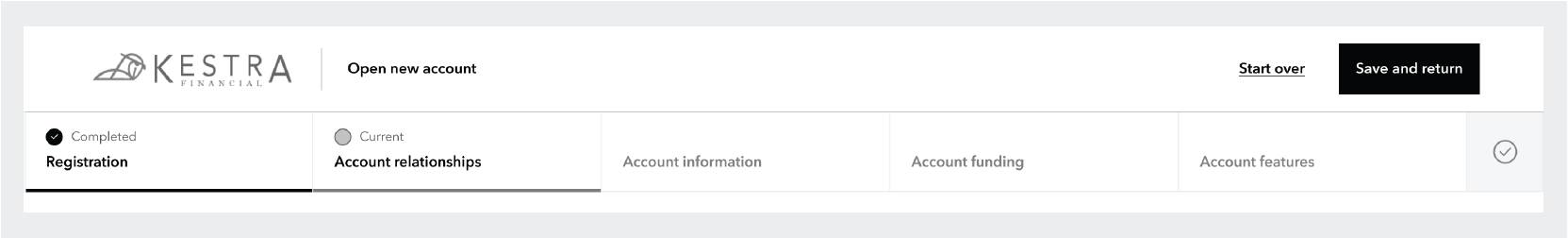
Initial grayscale wireframe of the digital account opening experience. The horizontal bar at the top divided the wizard into “acts,” which behaved both a navigation for the wizard as well as providing progress tracking for the user.
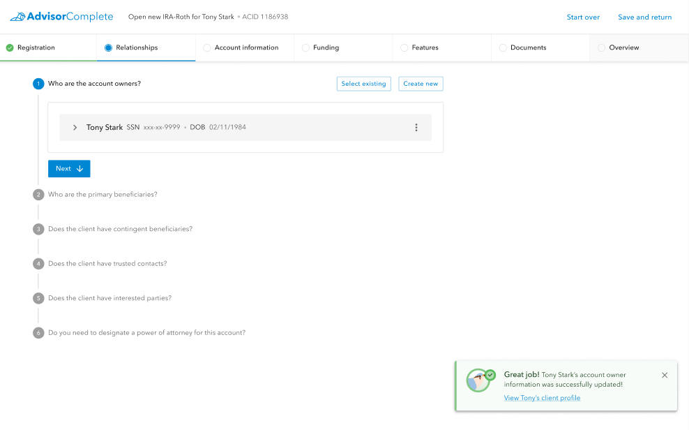
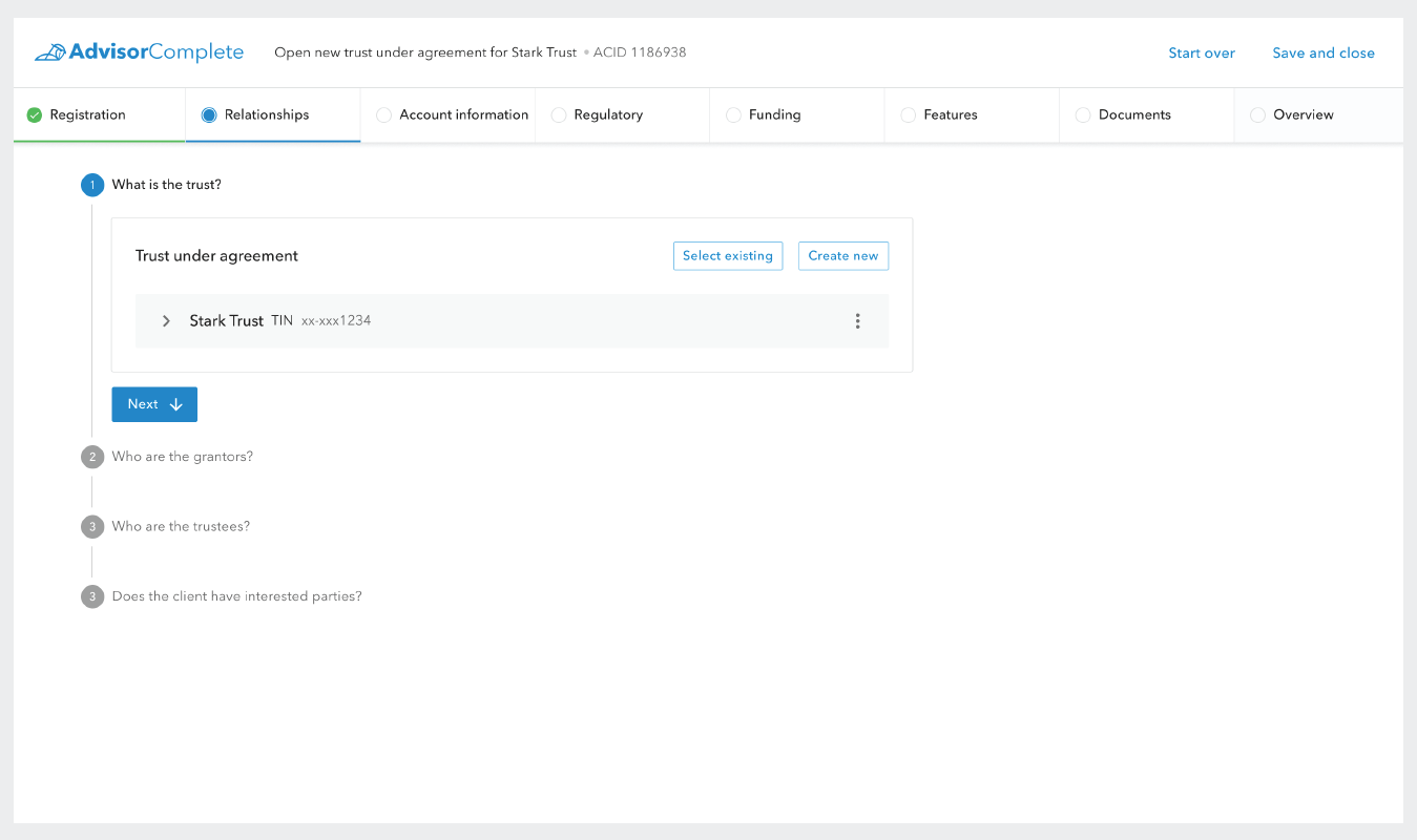
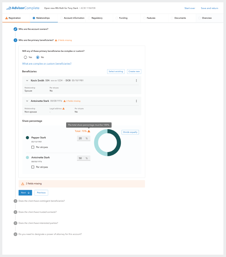
Below the horizontal act bar, the content of each act is further divided into sections called “scenes”. These scenes capture a particular data set, and are numbered and organized vertically down the screen. For example, the Relationships act is all about the people who hold different roles on the account. Within the Relationships act, there are scenes for capturing data about the account’s owners, beneficiaries, trusted contacts, etc.
Following the play inspired naming convention, the engineering team began referring to the individual data collection elements as “actors.” This hierarchy made it easy for the designers to keep content organized in meaningful ways. Each act would have several scenes, and each scene would have several actors.
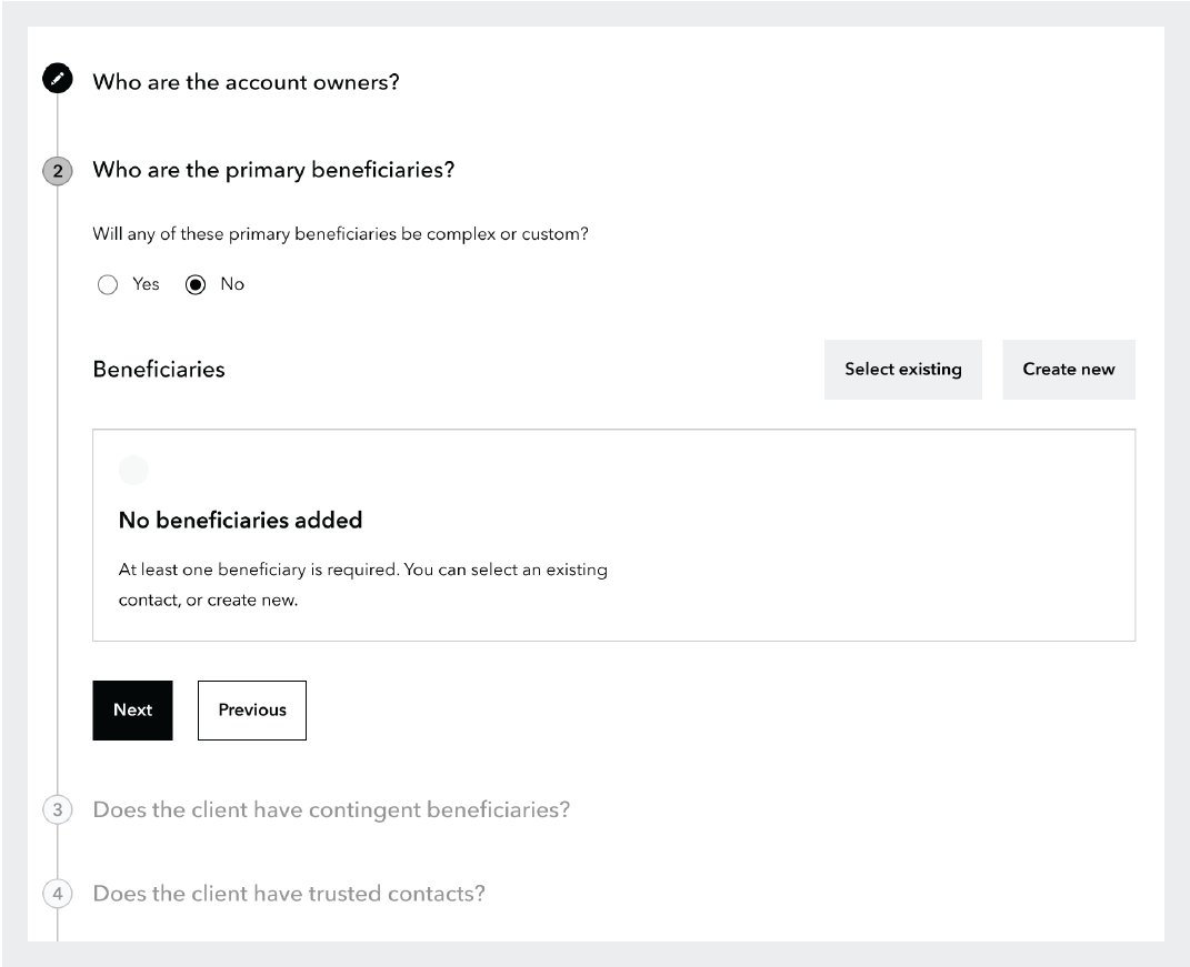
Grayscale wireframe example of scene and actor pattern within an act in the digital account opening wizard.
There were some instances, however, where the data collection required in a single scene could be quite lengthy. The required data for an account owner, for example, includes over fifty individual data points that need to be collected, and many accounts may have more than one account owner.
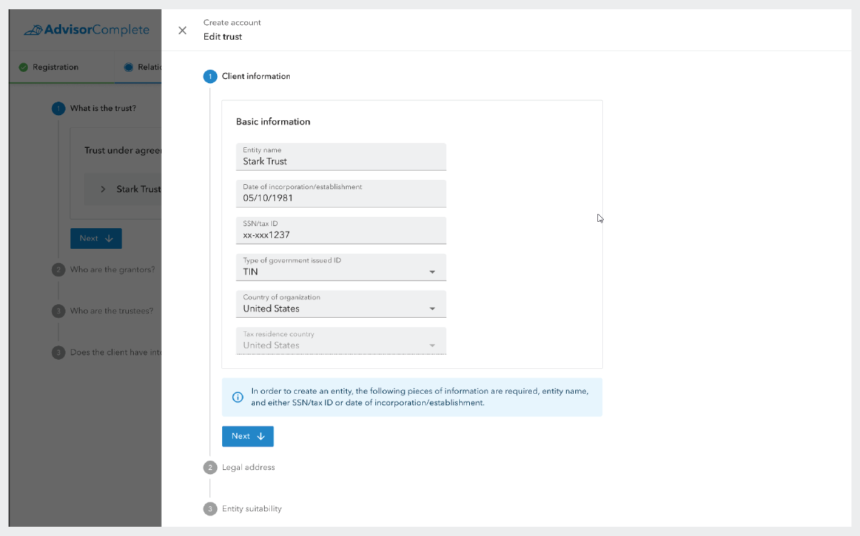
To address these situations without having the act and scene become too long and overcrowded, the team created a pattern to visually represent large data sets at the scene level, while allowing the data to be captured and edited in a slide-out side panel.
These side panels would allow the designers to further break down data collection into easily parsed sections for their users while also following the same UI pattern of scenes and actors. For example, the Relationships act would have scenes for all types of people associated to the account like account owners, beneficiaries, and trusted contacts, the side panel collecting the data for one of these people, like the account owner, would be further broken down into scenes like basic information, legal address, employment information, etc.
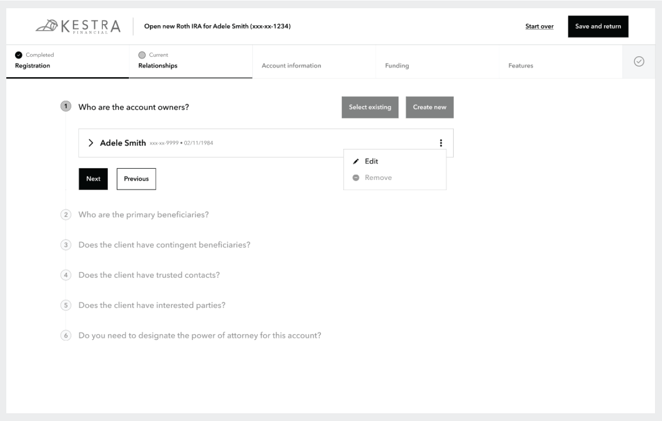
Example of the UI element representing the account owner and the drop down actions which can be taken on it such as edit and remove.
Following this pattern, the system can capture all required data needed for the opening of the account without creating a cluttered visual experience. This pattern was also enhanced by the use of specific conversational style language. The designers had heard from users in the past that data collection forms often used language that was not clear enough or used unfamiliar industry jargon for field labels. To address this, the design team took every opportunity to be clear and explicit in question phrasing.
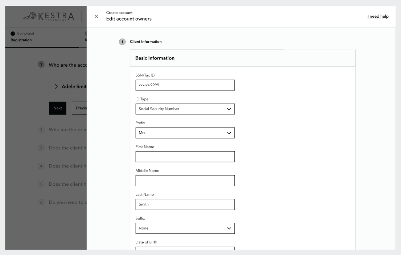
The edit account owner side panel is open showing the account owner’s data which is divided into scenes following the same pattern as the act page
To this end, the designers opted to phrase most questions as full sentences rather than single-word field labels and also employed name variables to specify a party by name for the sake of clarity whenever possible. The objective of these measures was for the user to be clearly guided through the data collection with as little ambiguity as possible so that the application could be completed quickly and easily and without error.
Reusable data
The design team also wanted to alleviate the pain their users felt when they would need to open multiple accounts for the same client and often found themselves needing to re-enter much of the same data multiple times. To solve this, the team made it easier to be able to search and select existing clients after they have been previously created. Previously, this reusable data pattern had only been applied to the account owner role, but the new system expanded on it to include all relationship types including beneficiaries and trusted contacts, as account owners will often use the same people in these roles across multiple accounts.
Previously created contacts could be selected regardless of the role they had been created for, and the user would only need to fill in any data that wasn’t previously collected. For example, if a contact had previously been created as a beneficiary, which collects a smaller amount of data, but is then selected as an account owner, all the of data collected for the contact as a beneficiary will be applied wherever applicable and the user will only need to provide any missing data required for the account owner role.
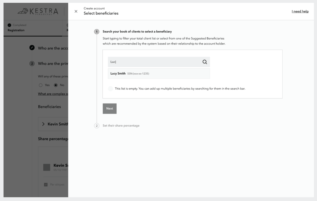
This screen shows an example of searching the financial professional’s client book for an existing contact to select as a beneficiary on this account. The search results show both the name and last four digits of the contact’s SSN to ensure the correct person is selected.
A modern look and feel
Now that the design team had worked out several of the foundational design patterns for the new application, it was time to think about details like color and illustrations. The team knew they wanted to utilize a modular design system that would allow their designers and engineers to easily build upon when new scenarios came up. In collaboration with dev and product leads, the design team decided to select an open source design system that could be modified as needed rather than trying to build something custom from the ground up.
Google’s Material Design 2 was chosen as the base design system for the digital account opening application.
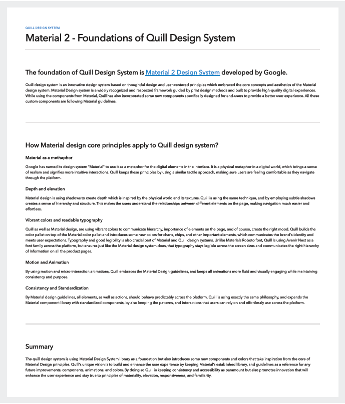
Design documentation explaining why Material 2 was chosen and how its core principles apply to the Quill Design System.
After comparing several options, design and engineering came to an agreement that Google’s Material Design 2 would work best for everyone’s purposes. The design team installed Material 2 into their Figma instance so they could use its components in their application designs.
The team’s visual designer went straight to work adjusting the out of the box theming for Material to begin updating the font, color palette, icons, and illustrations to become what the designers would eventually name the Quill Design System.
The name Quill was selected to invoke both a sophisticated instrument of creation, and align with Kestra Financial’s avian themed branding. Giving the new design system a unique and easily identifiable name would help the design team differentiate that style system from the core brand identity of Kestra Financial.
Bright, high-contrast colors
One way the design team decided to refresh the visual experience for the digital platform and AdvisorComplete as a whole was creating a new color palette with brighter more saturated shades. These colors also helped address long-standing issues some users had experienced with the previous UI color palette which often didn’t provide enough contrast for some of their users. Many of the primary users tend to be older in age, and occasionally struggled with the previous lower contrast color palette.
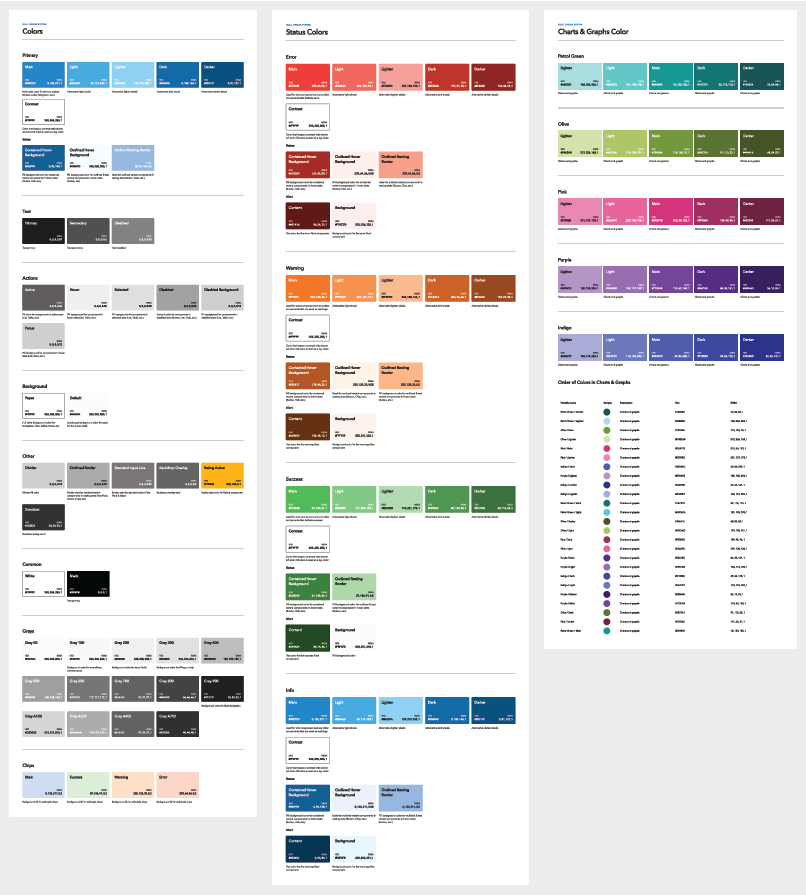
The updated high contrast color palette for the Quill design system.
WCAG 2.1 accessibility design
Given the specific visual needs of their users, the design team also ensured that the new color palette met visual accessibility guidelines. The design team would regularly test their designs through Google Lighthouse to ensure that the designers remained compliant with WCAG 2.1 accessibility guidelines.
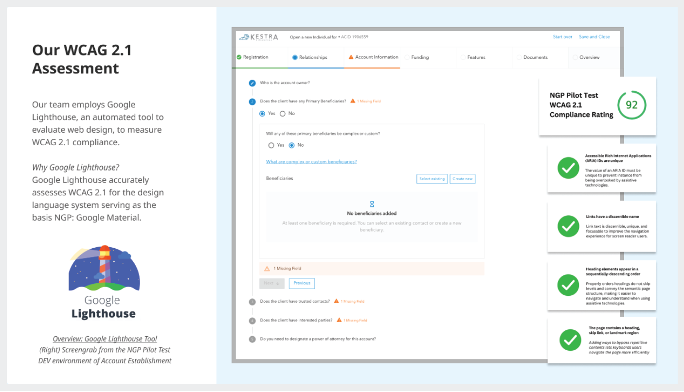
Our scorecard from Google Lighthouse which shows a 92% compliance to WCAG 2.1 for the digital account opening screens (formerly referred to as NGP: Next Generation Platform).
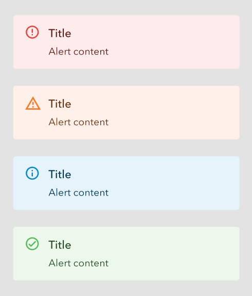
The four types of system alert messages which represent errors, warnings/missing information, instructions/information, and success, which are visually identified through color and iconography.
Example of two types of alert messages used in practice showing their use of both different colors and icons to communicate message type.
The design team also utilized color blindness filters to ensure that an ability to view color was never a requirement to understanding a visual message or indicator. To this end, the designers also made sure to use color in concert with text and icons or illustrations to give additional visual context indicators beyond color alone.
Illustration strategy
In addition to fonts and colors, the design team also wanted to ensure that there was a thoughtful strategy in how they approached other graphics and visuals used in digital account opening. It is said that a picture is worth a thousand words, and it’s true that when used appropriately, a well placed graphic or image can enhance communication in the UI to improve clarity and reduce wordiness. Therefore the designers established rules and styles for the three types of graphical elements used in digital account opening: icons, mini illustrations, and mascot illustrations.
An icon represents a single meaning or direction. Icons must be instantly clear, with the ability to span multiple languages. Generally everyone knows the meanings of common icons, or learns them in the end. Settings cogs, save icons, home icons, are just some examples.
Illustrations communicate an idea, or a series of ideas. They fill the niche when using a photo might be misleading, or distracting, because of the unnecessary ‘exact-ness’ of detail. And using an icon might not offer the amount of visual complexity required to communicate the message.
Because the design team needed to clearly, quickly, and concisely communicate with users across various app areas, functions, and interactions, they needed to take advantage of both the simplicity of icons to represent basic and constant concepts, as well as illustrations for more complex and metaphoric ideas.
Icons
When it comes to navigation icons, the designers chose a style that makes it easier and faster for the user to understand the icon at first glance. It is extremely important that every user must understand what the icon represents, and for that reason the designers chose simplicity and clarity as a universal language.

Examples of the navigational icons designed for digital account opening and AdvisorComplete.
The design team chose a style according to which icons are built from filled shapes and objects, for the reason that such icons are perceived by the human eye much faster than line icons. Each icon contains a minimal number of objects and details in order to avoid cognitive load. Navigation icons (as well as all other system UI icons in NGP) are characterized by a balance between sharp and rounded edges of objects.
Mini illustrations
All objects in Kestra mini illustrations are based on simple geometry which makes them scalable, easy to design, and to use. The use of graphic elements that can directly indicate a safe/certain profit is prohibited.
Examples of some of the mini illustrations used throughout digital account opening and AdvisorComplete.
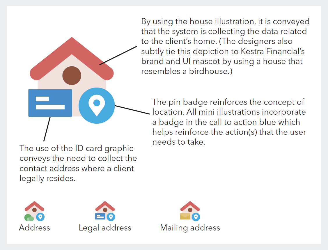
Diagram explaining the structure pattern of mini illustrations and how they combine illustration and iconography to convey different messages.
By combining different elements, the designers can reuse familiar illustrations to convey specific meanings.
Mascot illustrations
The star of the show for their illustration strategy is the kestrel mascot. He acts as an extension of the Kestra brand, and as the voice of the UI, allowing the design team to speak directly to the user.

The design team created Carl as a UI mascot for the digital account opening experience to help communicate with users as well as to bring a bit of levity to the system.
A mascot becomes a good interconnector between the user and the product. In interfaces, it can serve as a basic element of communication and interaction. Just changing its appearance (for example: mood, outfit, activities, etc.), it may quickly deliver a clear message to the user. They can also become a familiar element which can present success messaging to the user in a way that can tie different solutions to various use cases together.
Brand voice, tone, and character
Mascots are also a strong way to transfer and support the general tone and voice which is the foundation of a UI strategy and its connection to brand identity.
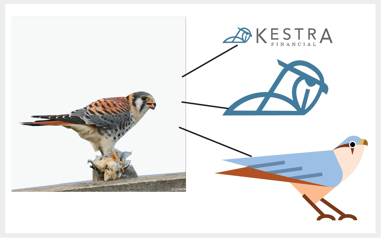
The design of both Carl and the Kestra Financial logo was inspired by the American Kestrel.
Emotional appeal
Although users tend to believe that logic and common sense rule their actions, a big part of the decision-making process relies on emotional appeal. A mascot is one of the well-checked methods to provide emotional triggers and feedback, and lets the interface or brand speak the user’s language. This way it makes the product more user-centered.
An example of a success modal with Carl congratulating the user on a successful action.
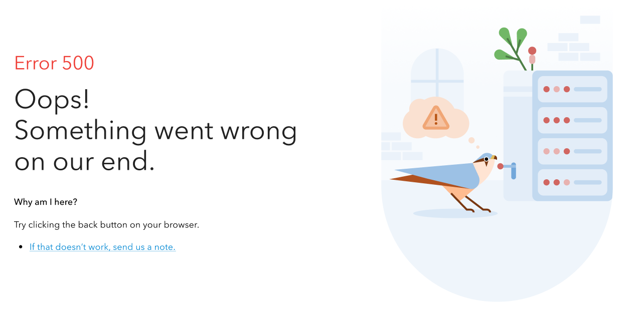
An example of using Carl to add some levity to system errors such as 404s.
Mascots are helpful in web and mobile interfaces: they liven up the interactions, catch attention and draw it to needed details, become a memorable element, create important consistency of a general stylistic concept, and create a strong imitation of direct and human-like communication with the user.
An example of a toast message featuring Carl helping to deliver a message to the user.
A mascot is also a good way to avoid extra copy on the screen when used in illustrations that show actions or interactions. This way, precious space is saved for other layout elements or just more “air” needed to create a good perception of data on the screen or page.
Opening financial accounts can sometimes be unexciting and monotonous work, so the design team were thrilled to be able to inject a bit of whimsy in their users’ day to day experience in the application with Carl.
On to the details
Once the design team had their new color palette and design system applied to the foundational structure they had previously established, the designers could move on to focusing on additional interactive details.
One concern the designers received from users familiar with the old system was that the amount of data required on any given page was often extremely lengthy. This could cause problems such as cognitive fatigue for their users from having to parse too much information at once, and could often cause a significant data loss if a user experienced a system or time out before completing the data entry on the page.
This scenario could happen quite often given the nature of financial professionals’ typical daily activities. Advisors and their assistants often need to pivot between activities to answer client calls and take meetings. Therefore, there was a specific need for the system to be flexible to its users’ availability.
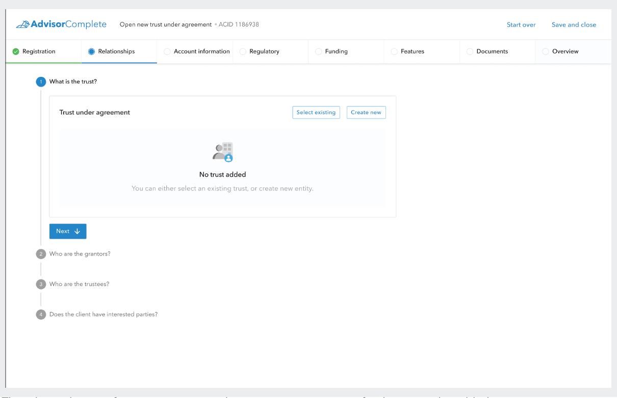
The relationships act for a trust account with an empty scene waiting for the trust to be added.
The relationships act for a trust account with an open side panel to edit the details of the trust.
As mentioned previously, the design team addressed these issues through organization of the data collecting process into smaller sections so that the actionable content on screen at any given time would not be over-encumbering to their users. Every one of these smaller sections would be punctuated by the “Next” button, which, as you can see in the example below, is the on-screen element that draws the eye the most. This was purposeful, as it helps guide the user through the next steps they need to complete, whereas other buttons are given a lighter secondary treatment.
The digital account opening application with the Quill design system and color palette applied.
The “Next” button also acts as a frequent save point, as each time the user clicks one, it saves their work in progress data. These frequent save points, in addition to a passive content save every 3 seconds, helps address the data loss problem some users have experienced in the old system.
Example of digital account opening’s tiered error communication system that communicated to the user that they had missing or errant data at the act, scene, and actor levels so that errors could never become “buried” in the UI.
Additionally, the “Next” button also triggers the error control system to run, so that as the user moves on to the next section, they are immediately informed of any missing or errant data in the previous section.
The design team wanted to provide the user with clear indications of any missing or errant data throughout the application. To this end, the team designed a tiered error notification system that provided the user communication about their errors at the act level, scene level, and actor level. This pattern helped guide users directly to errors that needed to be corrected before the application could be submitted, and ensured that errors would not be missed simply because they were buried within a particular page.
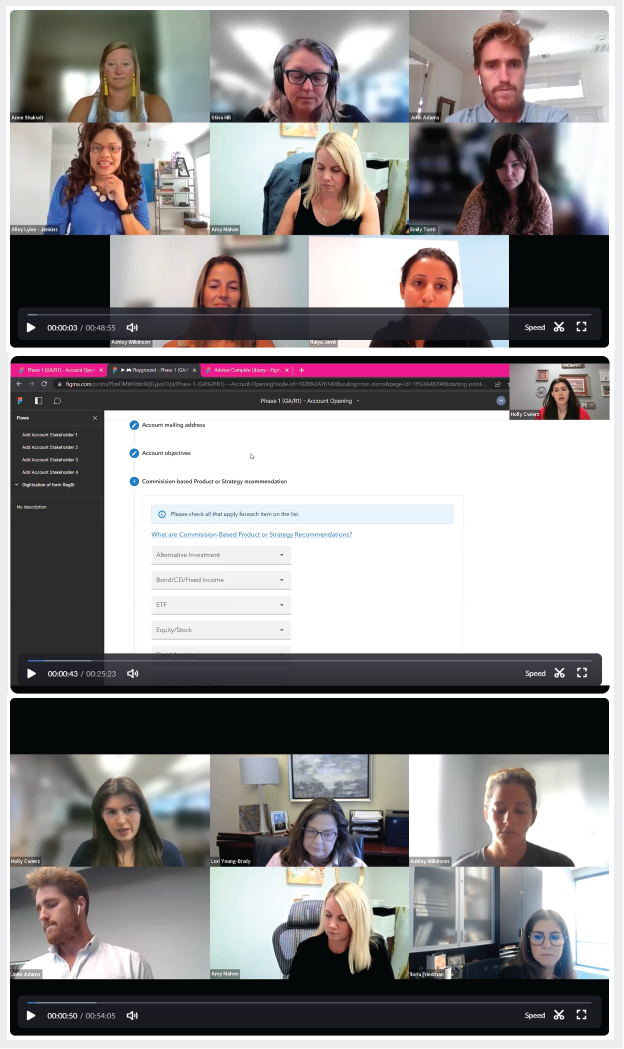
Screenshots of some of the Digital Platform Council meetings where Kestra Financial’s Product and Design teams presented designs to representatives of their user base.
Participatory Design
Now that the design team had made substantial progress in the functional structure and look and feel of the digital account opening application, the designers wanted to make sure they were on the right track by engaging directly with representatives of their key users. In December 2021 the design team created a Digital Platform Council consisting of financial professionals and assistants from various firms.
This council would meet every three weeks for over 2 years to show the ongoing design progress to this group of user representatives and gather their feedback. The design and product teams engaged in group discussions, presented A and B design options, and gathered survey responses to synthesize direct user feedback into their designs.
This participatory design strategy helped the design team always ensure they were building a solution that would meet the needs of their users. It also gave a valuable avenue of communication between their users and the product and design teams.
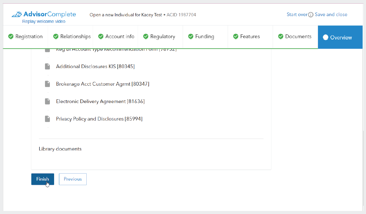
Screenshot of the digital account opening application review screen with all of the required data fully provided and the “Finish” button being clicked to finalize the application.
Finishing up the application
Returning to the account application, once the user had entered all of the required information and reviewed their entries for correctness and completeness, they would be able to click the “Finish” button to indicate that the account application was completed and ready to be moved to the next step in the opening process.
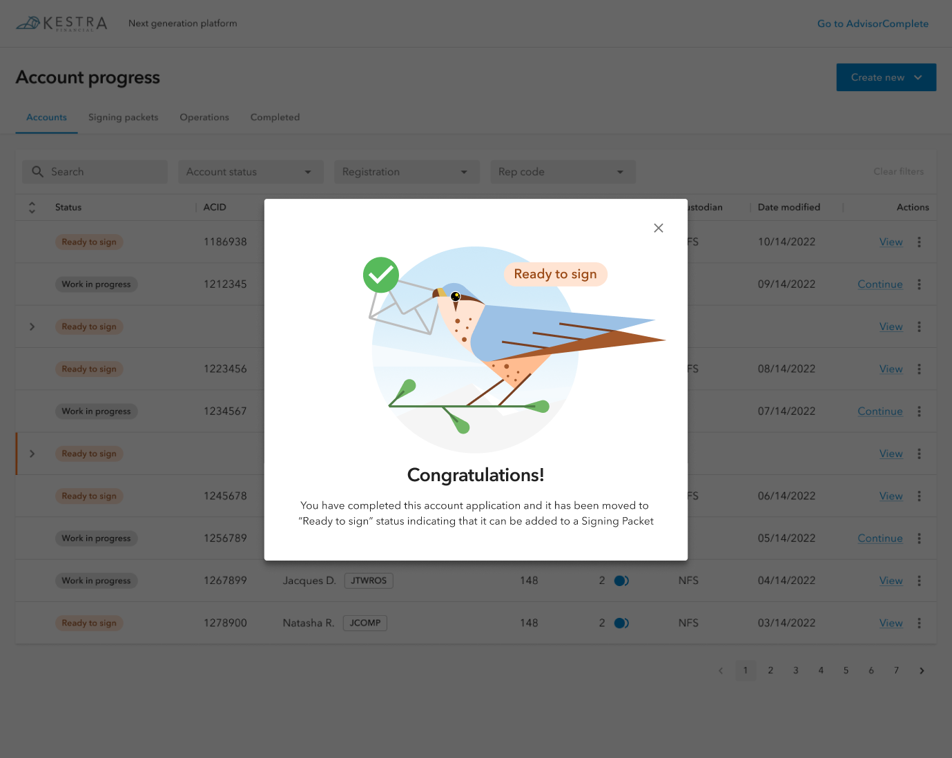
Once the “Finish” button is clicked, the user will receive a success modal congratulating them on completing their application. This type of success message is not merely an earnest platitude, but also helps address another issue that users of the old system often experienced: Many users provided feedback that it would often be difficult to know if they were “done” with a process.
Many users would get to a point at which they would think that they had completed their application, however they would often miss a final step to submit it. To address this, the design team created a pattern of celebratory success modals to provide a sense of finality to these types of processes and ensure that users always knew whether they had fully completed a process.
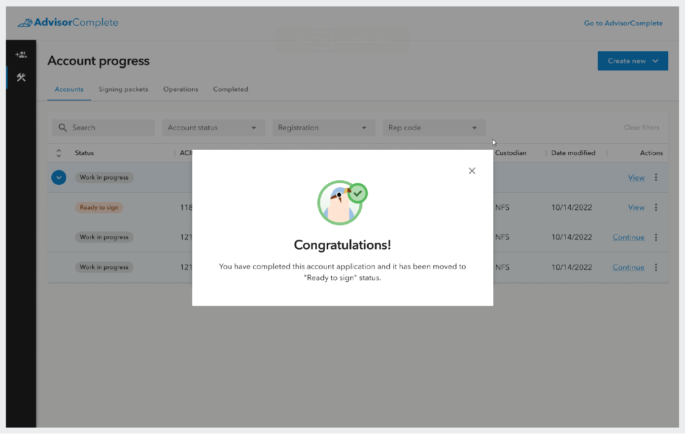
Screenshot of the success modal that users receive after they have completed their digital application.
Keep track of all in-progress work
Once users have completed their application and they dismiss the success modal, they will see that they have landed on a page called Account Progress. This page was designed to address an issue experienced in the old system wherein users often had a difficult time finding and returning to work that was partially completed or otherwise in progress.
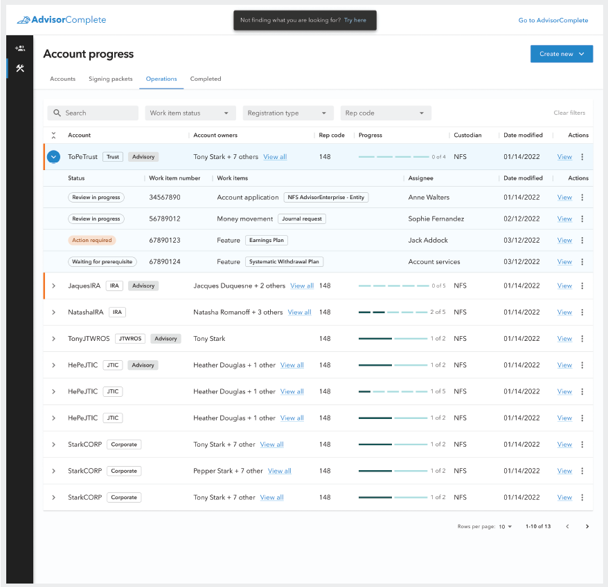
To address this, the team designed the Account Progress page to all work related to the opening of new accounts. The page has four tabs: Accounts, Signing packets, Operations, and Completed. Each of these tabs displayed a table view of work that fits into one of those steps of the account opening process. The work that is tracked here should move across the four tabs as it moves through the account opening process, but may also move back to earlier states if necessary.
The first tab, Accounts, holds all of a user’s account applications. Applications that were started but not completed can be found here under the status of “Work in progress,” while applications which have been completed have the status, “Ready to sign.” “Ready to sign,” indicates that these applications are ready to be added to a signing packet to be sent to the client(s) for signature.
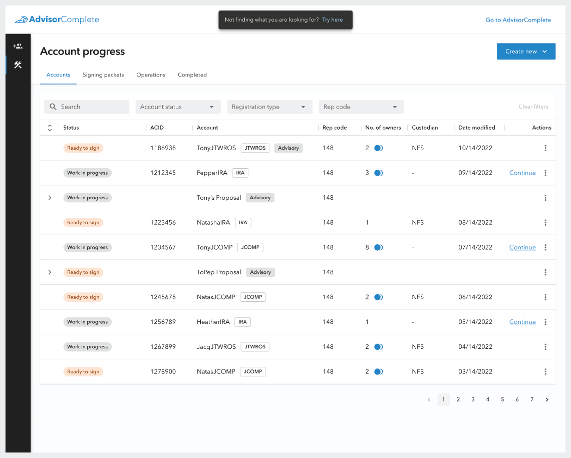
The Accounts tab on the Accounts progress screen showing all the Work in progress and Ready to sign account applications which the user has started.
The available actions that can be taken on a Ready to sign application.
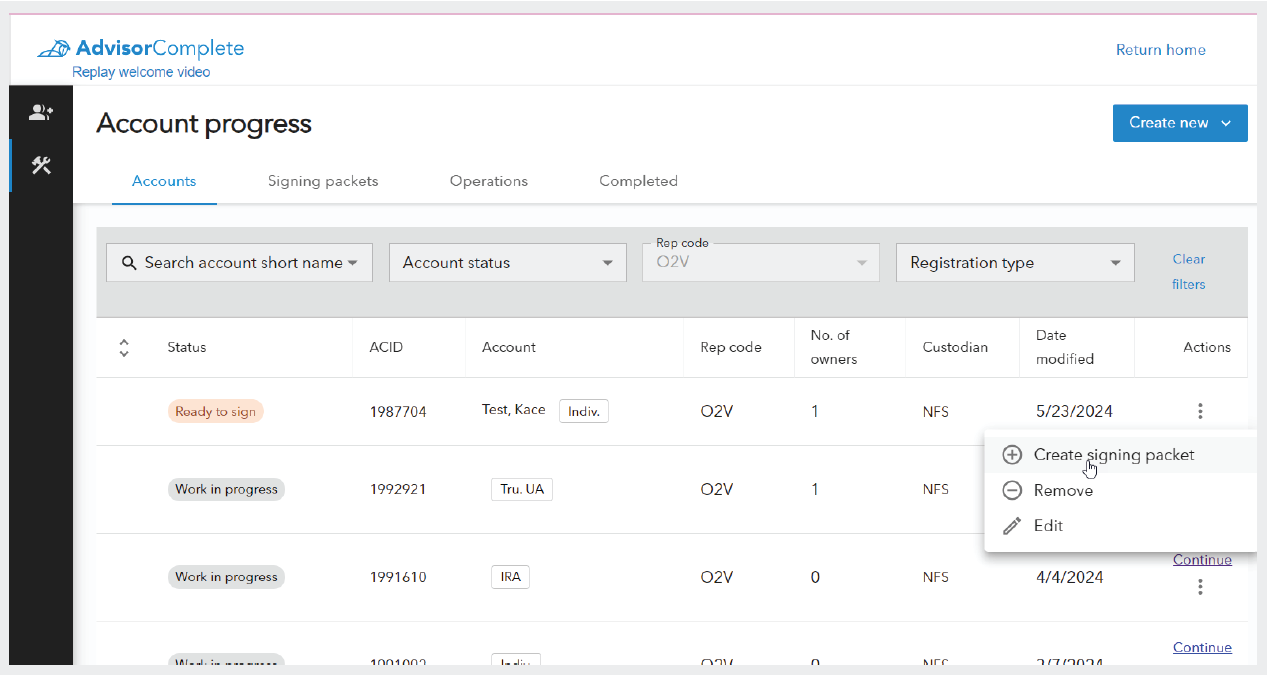
The user can take several actions on these applications from this screen. They may choose to Edit or Remove an application, which are actions that can be taken on both Work in progress and Ready to sign applications. Ready to sign applications have an additional action option, “Create a signing packet,” which will create a new signing packet which includes that application, and any other Ready to sign applications with the same account owners.
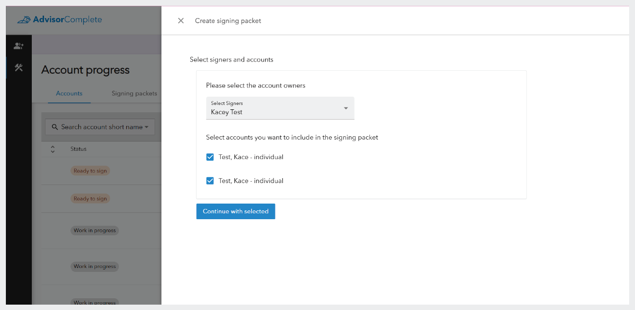
Side panel to create a signing packet which is formed by account signers so that all Ready to sign applications with the signers can be added to the same packet.
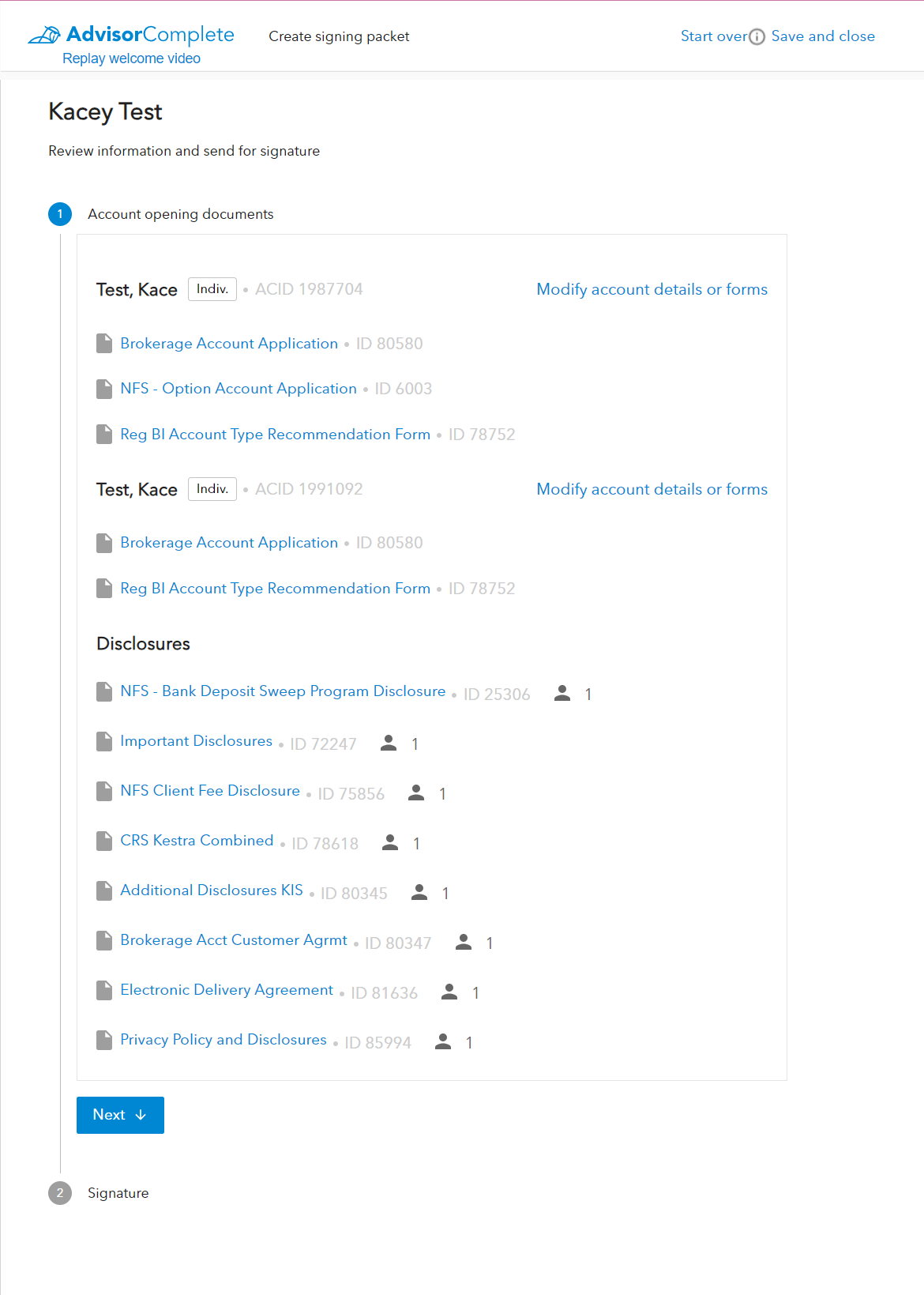
The documents scene in the signing packet creation wizard, which displays all of the account opening documents organized by account and the applicable disclosures.
Signing packets
The signing packet lists the account forms that will need to be signed by the signer/signers, as well as the account disclosures. By separating forms that require signatures from the disclosures, the product team was able to set system rules which required clients to only be presented with disclosures once every 36 months (as long as there were no material changes to the disclosures in that time).
The system also indicates which signer on the packet will be receiving any particular disclosure so that when there are multiple signers and one may have already received a set of disclosures in the course of opening a different account, they won’t have to view it again just because the other signer hasn’t viewed them yet. This change, along with the ability to bundle multiple accounts into a single signing packet, helped reduce the amount of repetitive paperwork presented to the clients by 40% on average.
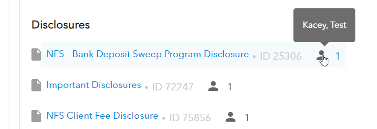
Close up of the disclosures section showing the people indicators, which identifies how many of the signers will receive that disclosure and the hover interaction which displays which signer will receive the disclosure.
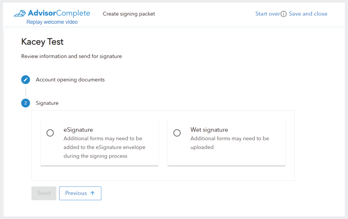
After reviewing the account opening documents, the user can then select which signing method the client would prefer. Signing packets can also be set up to account for both eSigning the paperwork through Docusign, as well as printing out the paperwork so that the client can sign on paper and then upload the signed documents back into the system, which is referred to as “wet signing,” in the system. Once a signing method has been selected, the user can finalize the packet by either clicking the “Send to client,” button in the case of a eSignature packet, or “Finish,” button in the case of a wet signature packet.
Signing packets are categorized by the signing method, either as eSignature packets that get signed through Docusign, or as wet signature packets which allow users to print the account documents, have them signed in person by the client, and then uploaded back to the system.
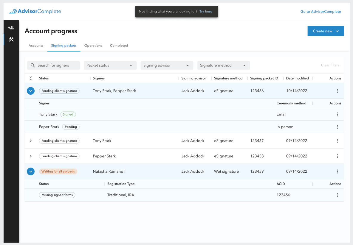
The signing packet tab with the two packet types expanded.
When the packet has been finalized, or if it was saved as “Work in progress,” it can be found on the second tab of the Account Progress page, the Signing packet tab. Here, the user can keep track of and take action on all of their active signing packets. Each type of packet appears as an expandable row on the data table displayed on this tab, but the data contained by each differs by the type of signing method that was selected for the packet.
When an eSignature signing packet line item is expanded, the user will see the signers listed on individual rows under the packet. This allows the user to keep track of whether the individual clients have signed their documents. Wet signature packets, however, show the individual accounts as line items under the parent packet when expanded. This allows the user to keep track of whether all the signed documents have been uploaded for each account within the packet.
There are also several more statues on the signing packets tab than on the accounts tab. On the accounts tab, the two possible statuses would always require action from the user, either to complete their application, or to add completed applications to a signing packet to initiate signing activities. However, within the signing packet tab, and the operations tab, the user will encounter statuses which may not require action from them because the next action must be taken by a third party. This third party may be the end client or it may be a home office user at Kestra Financial.
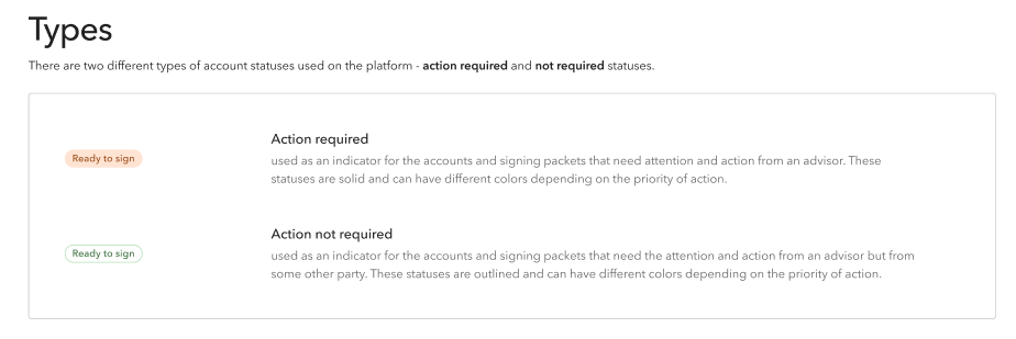
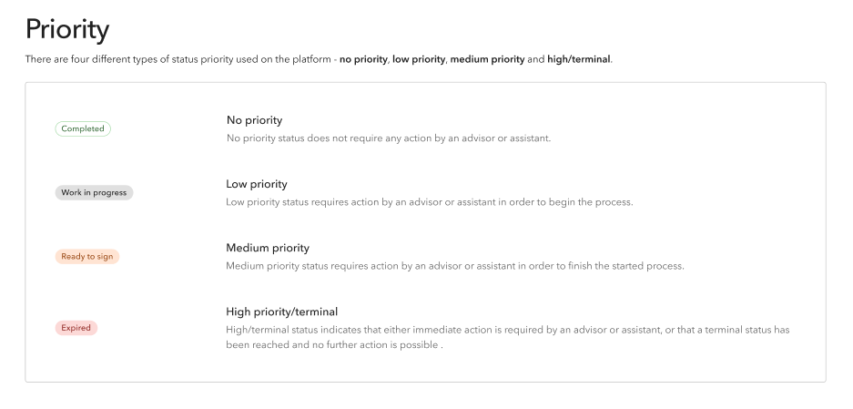
Status tags
In order to convey when a user needs to take action on an item and when they are waiting on someone else to take action, we created a visual system with the status indicator tags we display on each line item. There are two types of tags: filled and hollow.
Filled tags have a filled-in color background as well as color text, which is more prominent to users. This more prominent treatment is used for statues in which the user needs to take action and is designed to draw the user’s eye to the items that most need their attention.
Hollow tags have no background color and only use color text to indicate priority. These tags are less prominent next to the filled tags. Hollow tags inform the user of the status of an item which is waiting for a third party to take action, but do so in a way that doesn’t pull the user’s attention from the items that actually require the user to take action.
Documentation example showing the contrast in the filled and hollow tag styles.
Explanation of the color-based priority system used on status tags.
In addition to whether a tag is filled or hollow, the color of the tag also indicates priority of the expected action.The priority colors follow the same pattern of the system alert colors: green is used to indicate a successfully completed action, gray indicates a low priority status in which actions can be taken at the user’s leisure, orange indicates that an urgent action is required by the user, and red is typically only when immediate action is required or when the item has been set to a terminal state such as Rejected or Voided which cannot be remediated.
Operations
The operations tab of the accounts progress page holds all work item bundles which are being processed by Kestra home office.
Once all the paperwork has been signed, either digitally or physically, and submitted to Kestra Financial, the user can keep an eye on their paperwork bundle as it is processed by Kestra’s account services department. Each piece of paperwork that must be reviewed will be bundled under the line item for the account. The account application and all other items bundled with it are now in a state called work items. Work items are the digital representation of paperwork submitted to Kestra which must be reviewed, and then accepted or rejected by the Kestra home office. These work item bundles are found on the Operations tab on the Account progress page.
The operations table primarily acts as a place where users can check on the status of work that is being processed by Kestra home office staff. It is common that work will be processed and completed through this step in the account opening process without requiring any action from the user. However, there are instances when Kestra’s account services team might require additional information or action from the external users, so there are additional visual indicators included in the table to help communicate status, progress, and assignment as quickly and easily as possible to users.
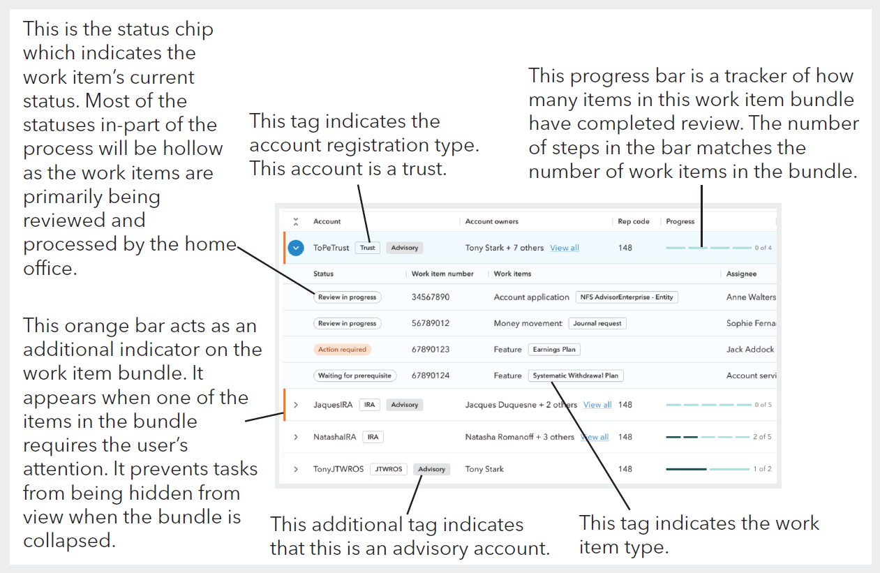
Diagram explaining the meaning of the various tags and indicators used on the operations tab to communicate information to users.
While the old system had a similar table where work items that had been submitted and were being processed could be reviewed, it didn’t bundle related work together. Instead, work items were split apart which removed context for both the home office processors and the external users. It also occasionally caused problems when a particular order of operations needed to be enforced for the work items to be processed correctly. The Digital Account Opening experience solves this problem by understanding when certain work items require that a prerequisite has been completed first. For example, in the case of most work item bundles, the account application work must be processed and accepted before any other work items in the bundle. Therefore, when a work item bundle gets submitted to Kestra and first appears on the operations table, only the account application work item will be in a Waiting for review status, while all others will be in Waiting for prerequisite status. This ensures that all work is processed in the correct order, while also clearly communicating to all parties where each piece of work is in the review process.
Work item details
Each of the work items in a bundle can be open and viewed as a work items details page. This page holds all of the pertinent information about the work item and provides functionality to take actions on the work item. At the top of the page is the summary ribbon, which displays all attribute information for the work item, along with the actions button which can be used to take actions such as uploading a new document and requesting that the work item be voided. Below the ribbon, the main content is divided into three tabs: Work item comments, Documents, and History.
The work item comments tab is a space where internal and external users can easily communicate on the work item. In the comments area, an internal processor might request additional info from the external user. The external user can then reply with the requested information, allowing the internal user to finish processing the work item.
The documents tab on the work item holds any specific forms or documents attached to this work item. The user may also upload additional documentation that may be requested by the internal processors.
The history tab provides a history of all status changes and actions taken on the work item, along with who made the change or action and a date and time stamp. This record of the work item’s history provides helpful information regarding what has been done to the work item and by who.
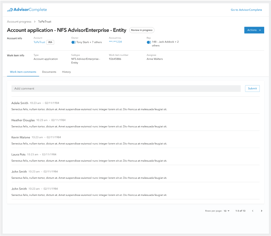
Users can check work item information, leave comments, and take actions from the work item details page.
Completed tab
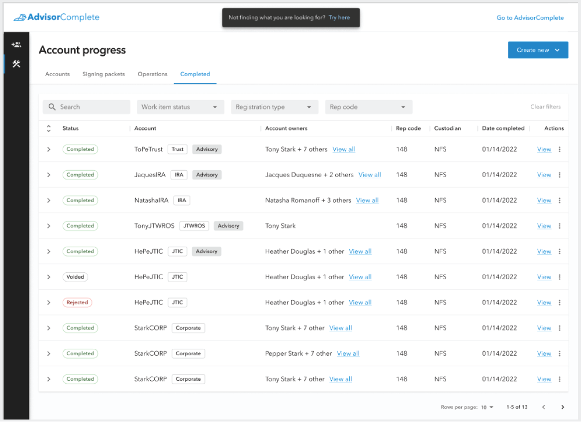
The Completed tab on the Accounts progress page.
The final tab on the Accounts progress page is the Completed tab. This tab is the terminal location for all completed new account paperwork bundles. This is where a historical record of all work processed through the Accounts progress page is located.
The table on this tab is structured in the same way as the Operations tab, and all of the work item bundles in this table are in a terminal status of either Completed, Voided, or Rejected. Completed work item bundles indicate all of the new account paperwork was found to be in good order and the new account was opened successfully. Work item bundles in the Voided status indicate that at some point, the external user requested that the new account paperwork be voided, likely because the client either requested the account to be drastically changed, or decided not to open the account after all. A Rejected status on a work item bundle indicates that the new account paperwork was reviewed and the home office decided to reject the account. Rejected accounts cannot be revised so they are sent directly to a terminal status. Should the user want to reattempt opening an account for that client, they would need to start over from the beginning.
UX testing lab at Ascend 2023
With the DAO project near completion and the launch date for the new experience nearing, the design team sought to get additional user feedback. Every year, Kestra Financial hosts a conference for its partnered financial professionals to gather and network. So for the 2023 event, the design team hosted a UX lab where financial professionals could test out the new experience for the first time.
Each participating user was given a simple task with little instruction to complete in one of four areas of the new experience: Completing a new account application, creating a signing packet, completing signing activities, and commenting on a work item to resolve a required action. The participating users' experiences were recorded as both a screen recording and a facial recording to capture user expressions. Both of these recordings would be synced up later during result analysis to get a whole picture of the user’s experience navigating the new system.
A total of 27 individual users participated, and the design team was able to identify areas in the experience that appeared to be common sticking areas for participants that could be refined ahead of launch. Among the users which completed the new account application task, it was found that most users were able to complete data entry for the application in less than 10 minutes, which was a massive improvement compared to previous experiences in the legacy system.
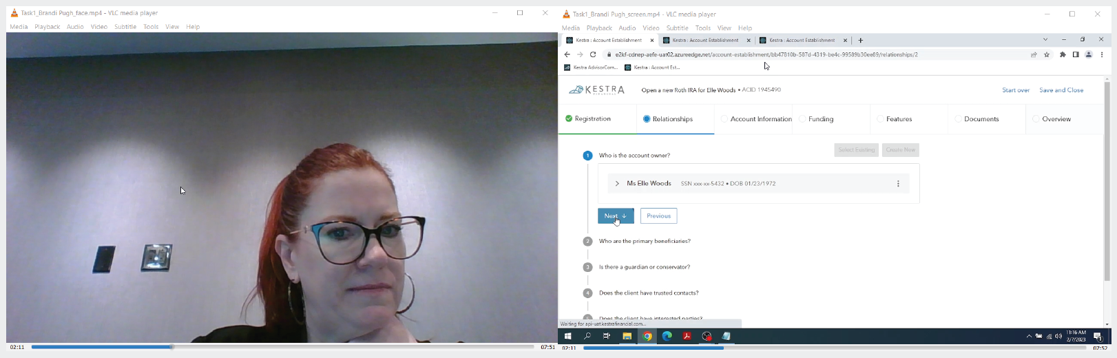
Synced up facial video and screen recording of a financial professional testing out the new Digital Account Opening experience at Ascend 2023, Kestra Financial’s annual conference for its partnered firms.
Launch - July 2023
After 22 months of design and development, Digital Account Opening was finally launched to Kestra Financial’s users in July of 2023. It was successfully rolled out to all of Kestra’s partnered firms over a multi-month transition plan.
While the rollout was not without bumps, most launch-related issues were resolved quickly and several firms reported that the new experience was much more intuitive and easier to train new employees on. Additionally, the many operational efficiencies built into the Digital Account Opening experience, such as reusable data sets, enhanced error handling, and streamlined experience not only helped increase eSignature adoption but also led to a majority of accounts being able to be opened within 24 hours or less. The transition to the new experience also saw a 40% reduction in redundant paperwork for our uses and their clients.
A year on from the initial launch, the new Digital Account Opening experience was a major success for Kestra Financial’s design and product teams.
Awards
Since the launch of the Digital Account Opening project, Kestra Financial's broker dealer platform, AdvisorComplete, has earned several achievements which further illustrate the success of the new application and the value it brings to users.