Enhanced Onboarding
A fresh first impression for new financial professionals
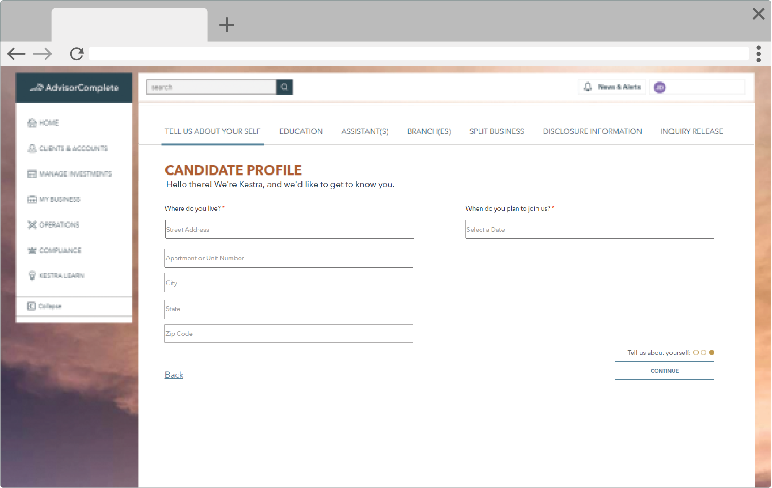
These are screens from a data entry application to collect onboarding information from newly acquired firms. This would be the first impression these transitioning financial professionals would have of our systems so we sought to create a new and highly intuitive user interface. This project took place in 2017.
Working closely with members of our onboarding team, we decided to organize the data collection into an easily navigable wizard. This format allowed us to segment the data collection into smaller sections so as not to overwhelm the user with too much on any given screen. This also limited the likelihood of extensive data loss as each time the user clicked to the next screen, their previously entered data would be saved.
Card-based design to hold multiple data sets in a finite space
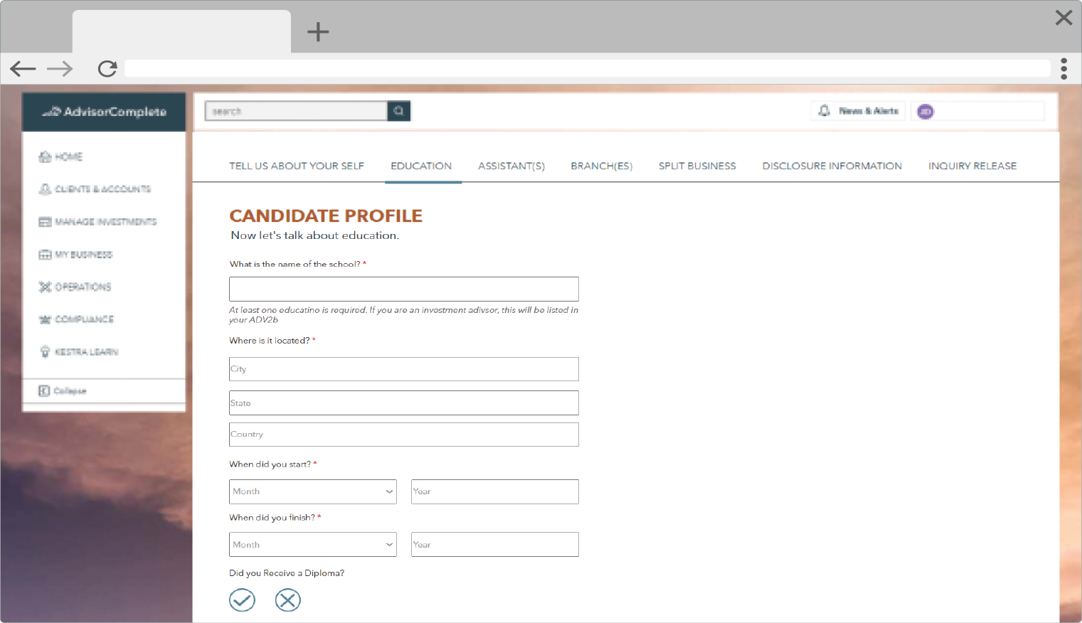
This screen is an example of a set of reusable data collection fields that allows the user to enter data for multiple schools without requiring the screen to repeat the same fields.
When a user completed the data collection for one school, they would click the “+ADD ANOTHER SCHOOL” button to save that data to a card representation and clear the collection fields so the user could enter the data for the next record.
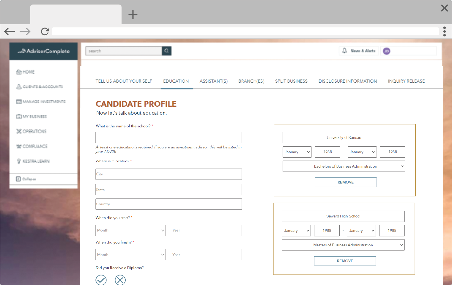
Here we can see two examples of the school cards.
We experimented with a card that held editable fields so a card’s data could be easily edited after being saved within the card itself.
The school card could also be easily removed.
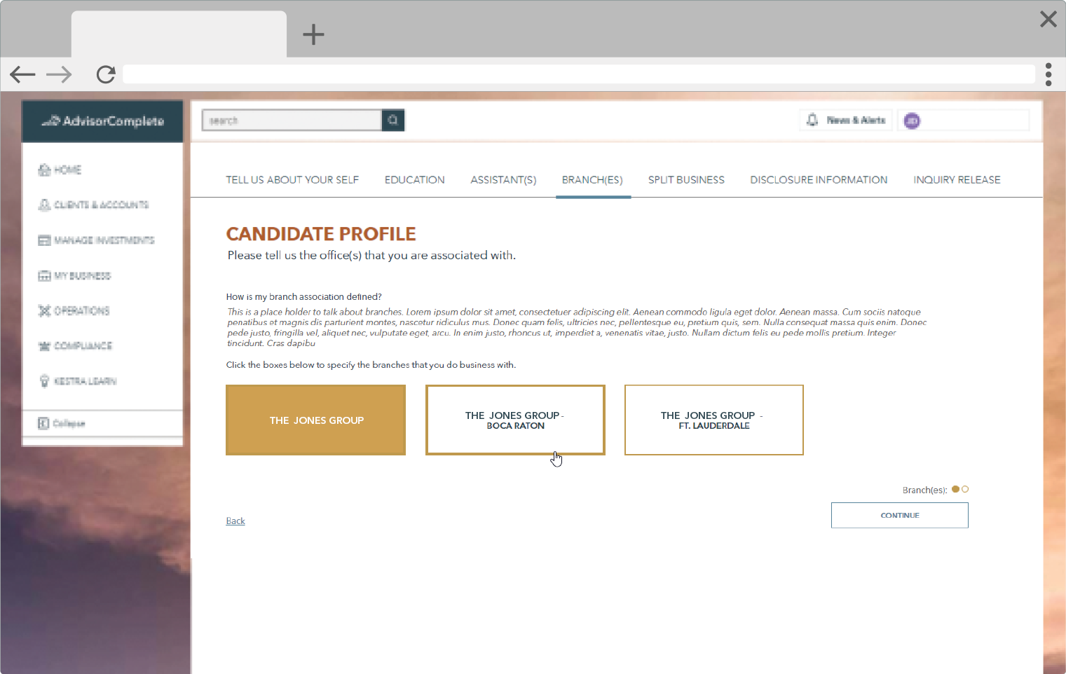
Flexible layouts to account for varied data needs across our ecosystem of users
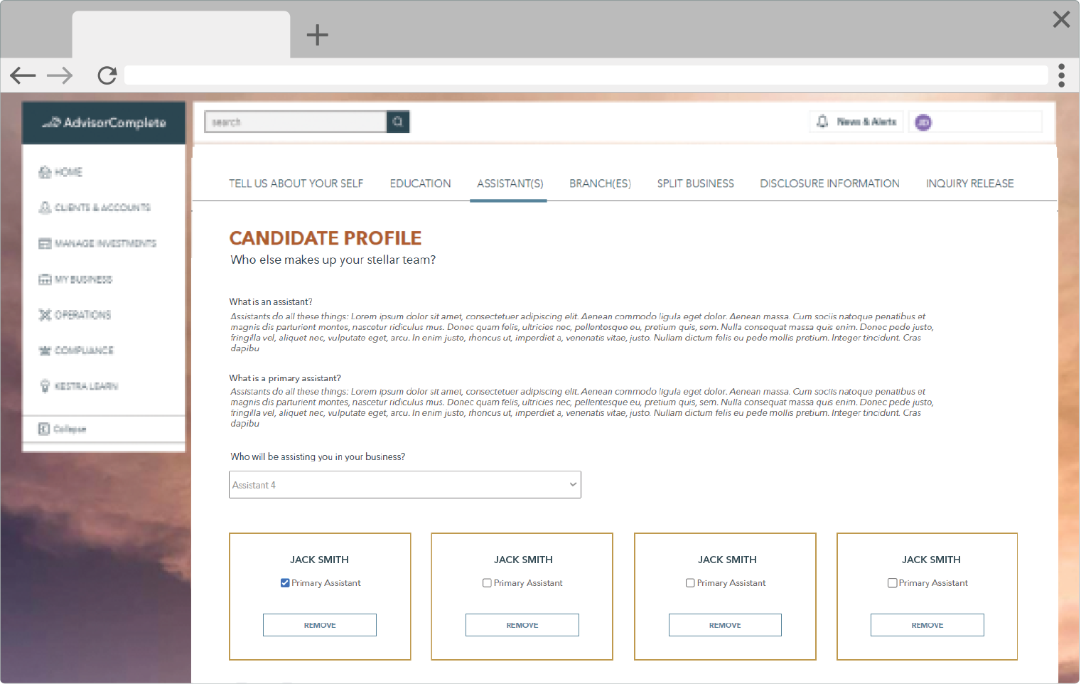
Again we used cards to represent the people acting as assistants to this financial professional. The user could select people from a list, which was generated based on employee data previously entered into the system, and add them as assistants. The user could then also select which people would also be primary assistants.
This layout worked well with both small and large data sets, which was a necessity as the firms we support could be small single producer offices or large ensemble teams.
Touch-friendly design which gives our users access options
We wanted to make it easy for users to be able to interact with the application on both a desktop computer and a tablet so we often utilized large tap-able buttons. This made it easier to select items on a touchscreen, and the large buttons also fit easily into repeatable grid patterns which made it easier for the UI to adapt to displaying smaller or larger groups of data.
Easily upload signed documents, or initiate eSigning through DocuSign
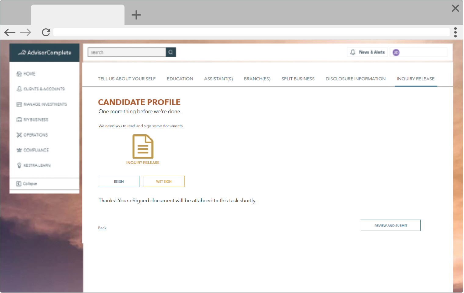
On the final screen of the wizard, we ask the user how they would like to sign the inquiry release form and provide feedback regarding the next steps.
Once the form was either esigned or wet signed and uploaded, the user could continue to the summary review screen.
Review all your inputted data in one place before submission
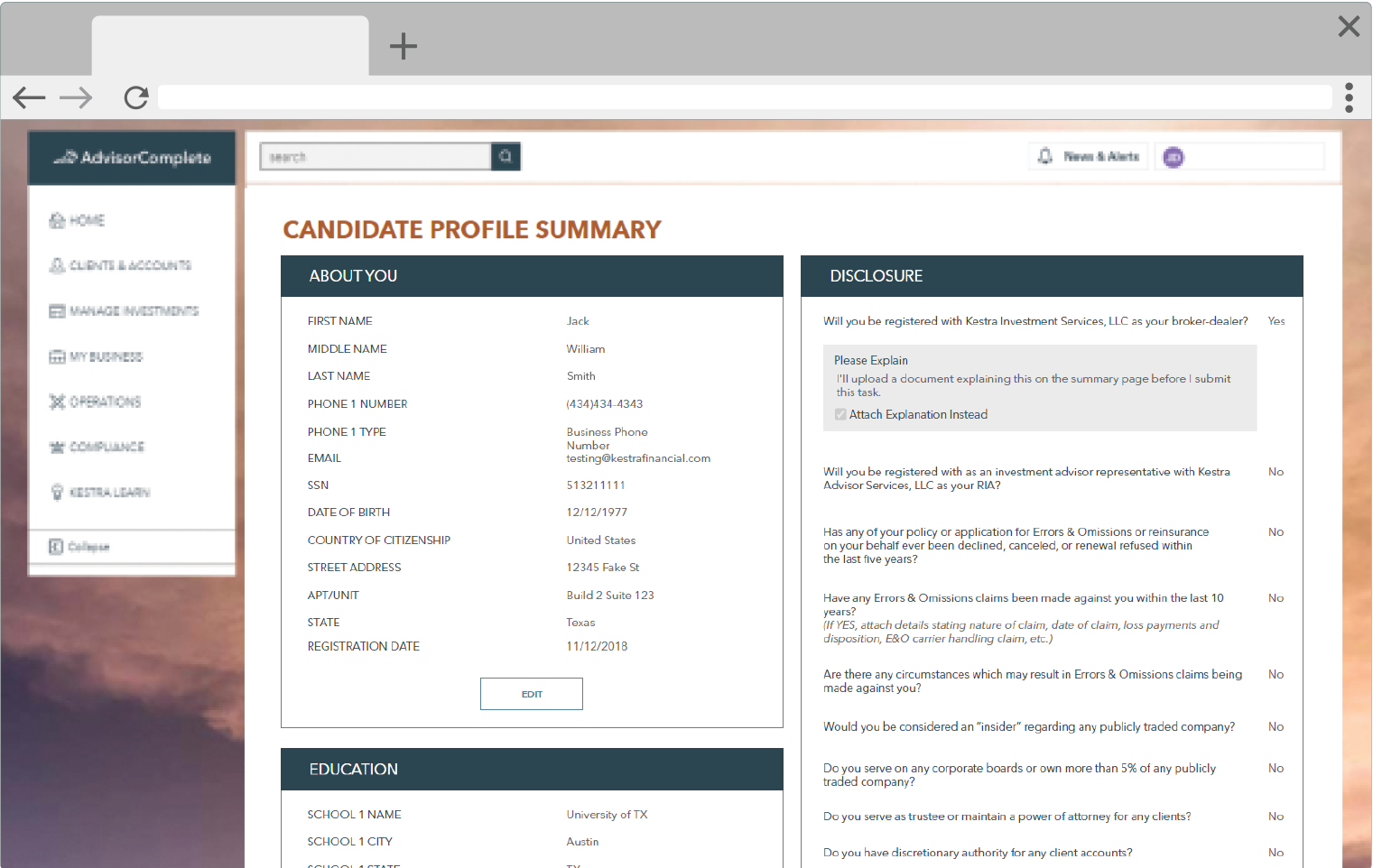
Once the user has completed all of the data collection of the wizard, they would then be able to review all of the collected data on one screen. Each section had an edit button which allowed the user to easily navigate back to the corresponding section of the wizard to be able to make any necessary changes.
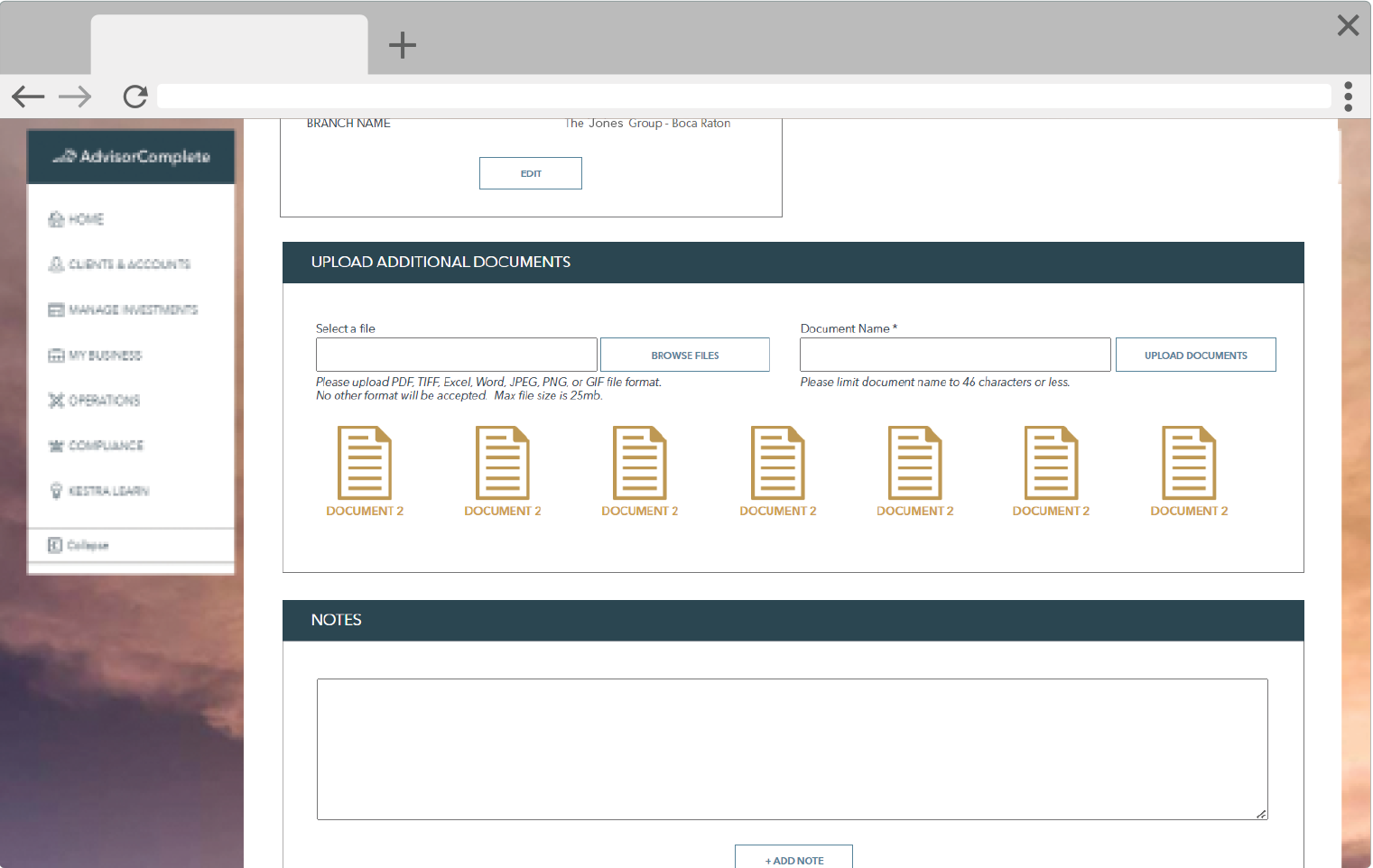
We also provided a section where the user could review any documents that had been uploaded throughout the wizard, and where they could upload more documents as needed. Due to regulations, we could not provide the ability to remove documents.
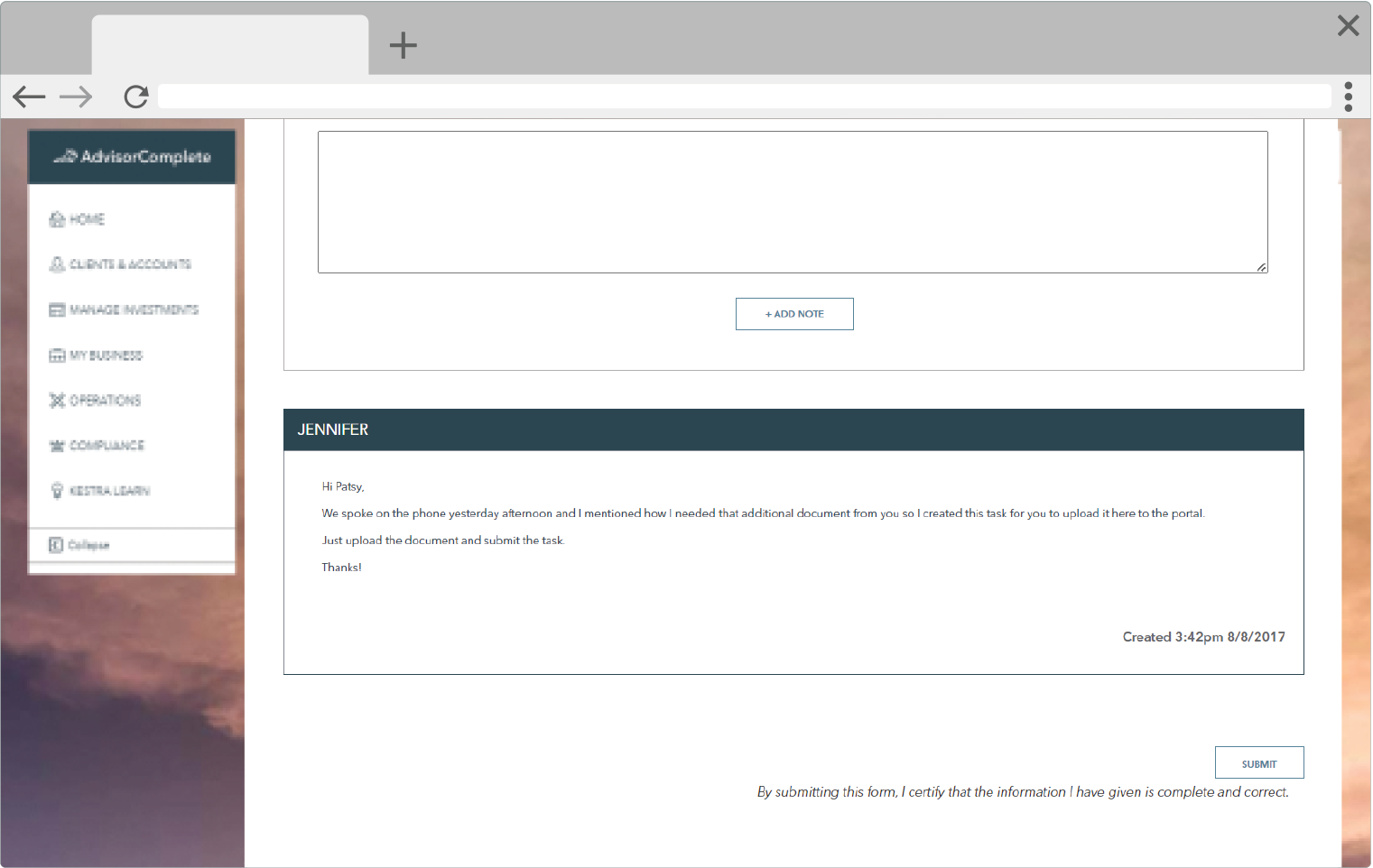
Finally, we also provided a notes section where users could correspond with their on-boarding consultant and get answers to any questions they may have had about the task. Once all of the data was reviewed the user would submit the task to our home office.